
Portfolio in graphic design / advertising.
A portfolio of advertising and graphic design driven by ideas.
Click the main image of each project to view it larger.
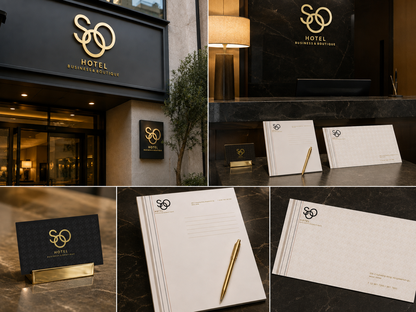
Soo Hotel

Boutique Hotel Corporate Identity
The SOO HOTEL brand identity project focuses on translating the distinctive sophistication and calm atmosphere of a luxury boutique hotel into a visual language.
Through the contrast of gold and dark charcoal, the identity creates a refined first impression. A consistent graphic system across the logo, stationery, key cards, letterheads, and signage reinforces the brand’s premium character.
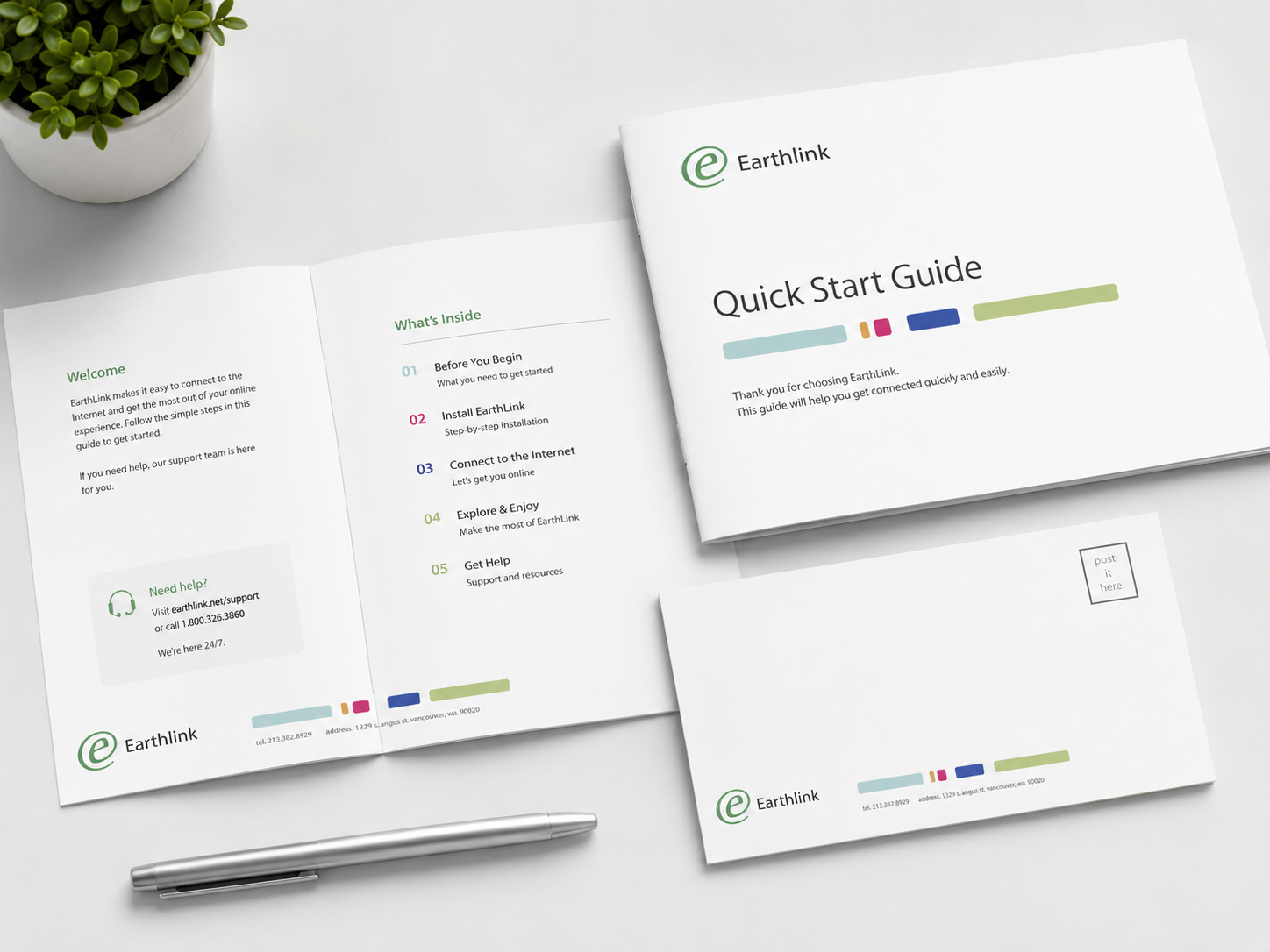
earthlink
인터넷·통신 서비스 / Brand Identity & Trademark
BRAND IDEA
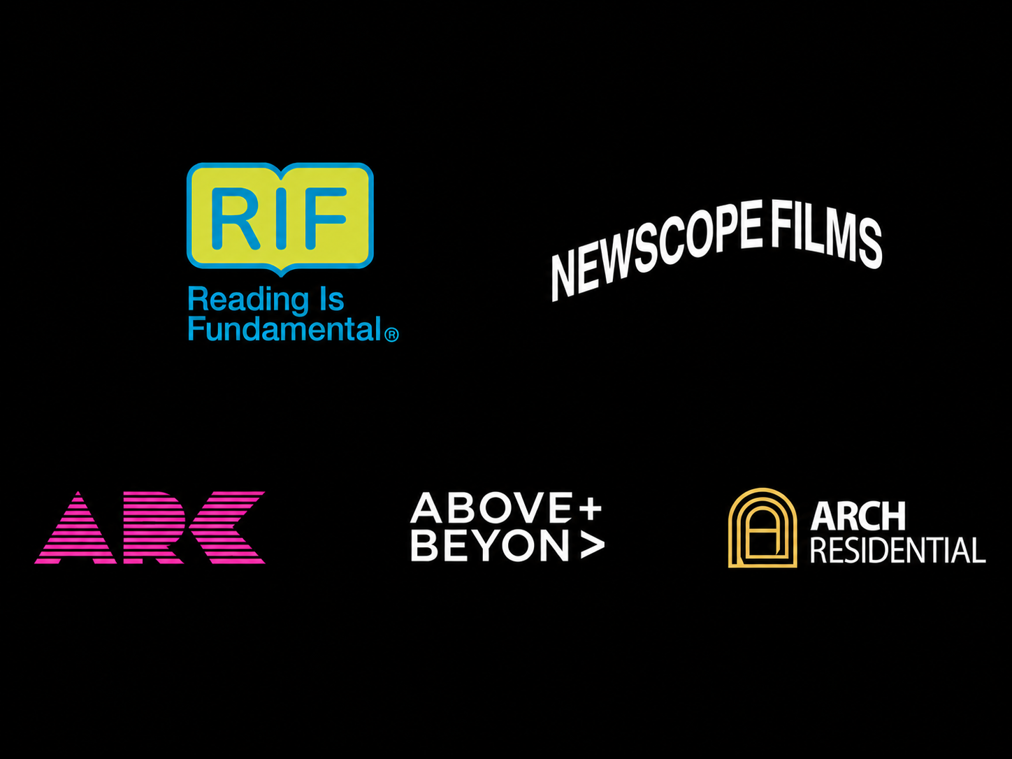
The EarthLink logo was inspired by replacing the familiar “@” symbol used in email addresses with the brand’s initial, “e.” It combines EarthLink’s role in connecting people through the internet and email with a universally recognizable symbol of digital communication.
The circular form represents connection and the flow of networks, while the “e” at its center directly expresses EarthLink’s brand identity. The result is a simple, memorable mark designed to extend consistently across business cards, letterheads, guides, and other brand applications.
BRAND IDENTITY / TRADEMARK
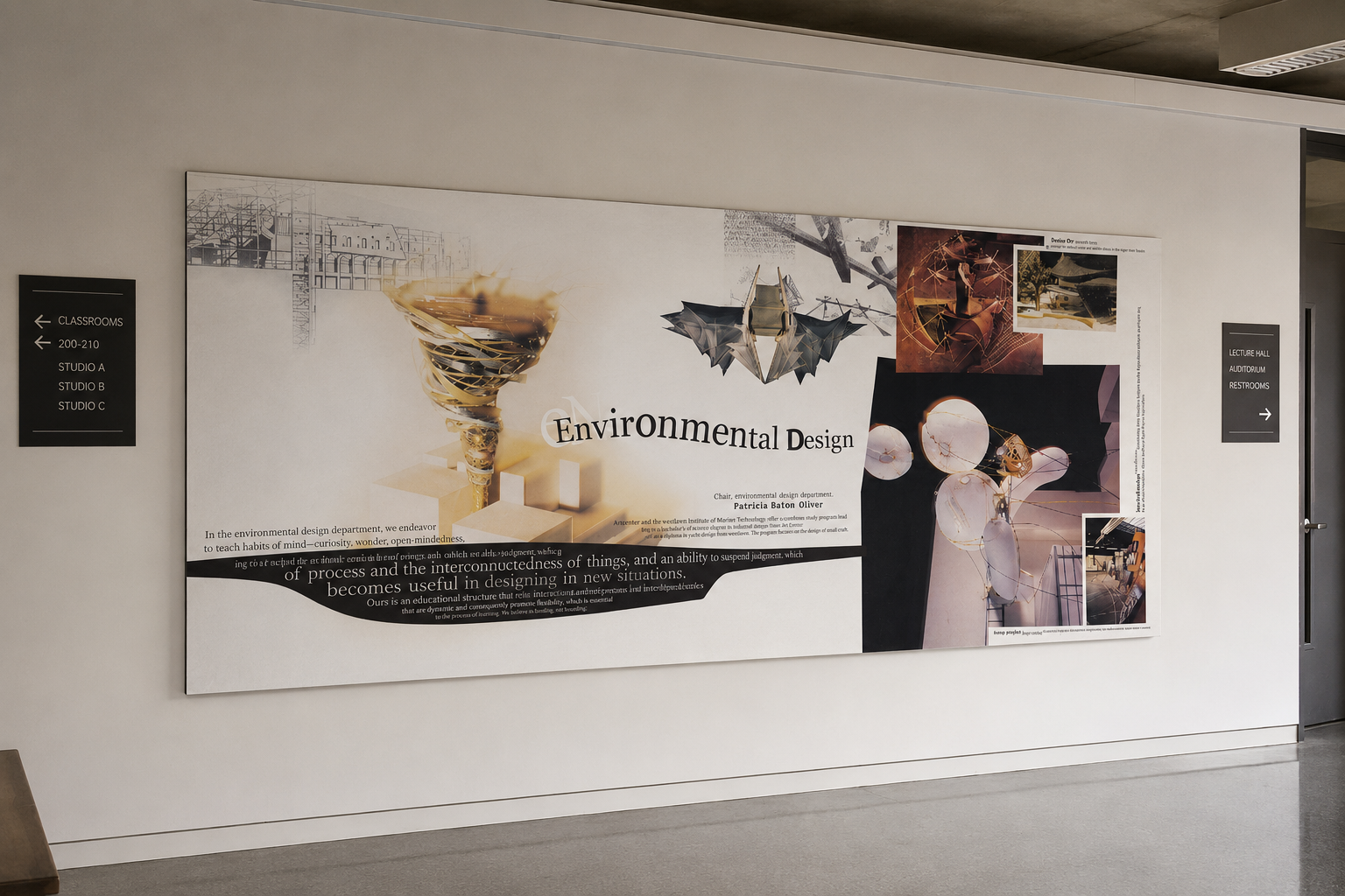
Environmental Design | Wall Graphic & DepartmenT
Environmental Design Department Poster
SIZE & SPECS
Type: Large-Scale Wall Graphic / Interior Display
Size: Approx. 36 × 72 in. (scaled to fit the installation environment)
Medium: Digital Collage, Archival Wall Vinyl / Panel Print
PROJECT OVERVIEW
A large-scale wall graphic created to express the identity of the Environmental Design department and its exploration of space, structure, and human experience.
Experimental spatial concepts, objects at varying scales, and architectural references were reinterpreted through collage to create a layered and multidimensional visual language reflecting the department’s approach to design.
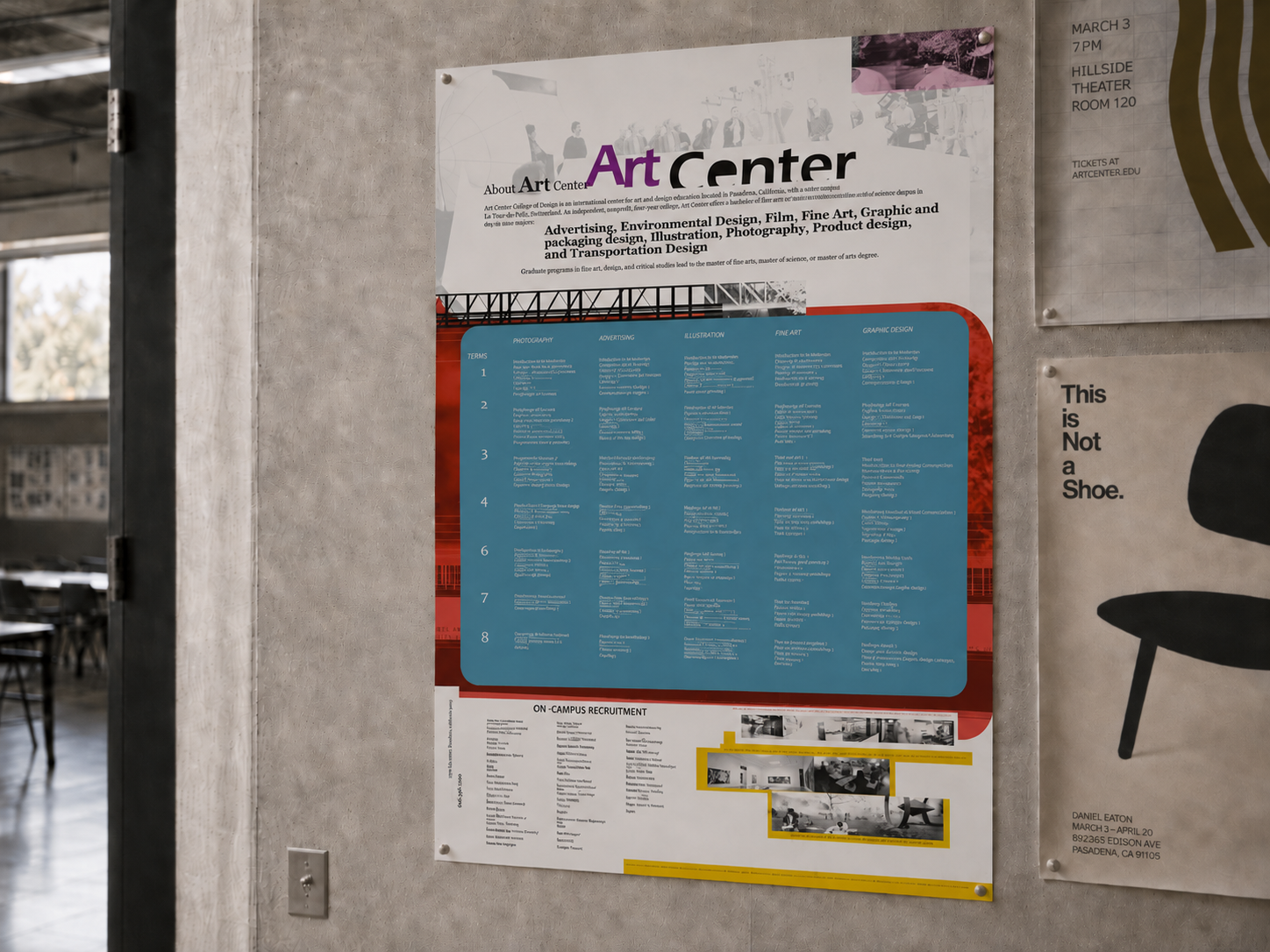
Art Center College of Design :
Curriculum & Information Design
Design Office Project
PROJECT DESCRIPTION
This infographic poster was created to communicate ArtCenter College of Design’s academic structure and visual identity. A structured grid, bold typography, and strong red graphic elements organize the information clearly while maintaining the school’s experimental and creative character.
TECHNICAL SPECIFICATIONS
Medium: Archival inkjet print on premium paper
Size: 61 × 91.5 cm (24 × 36 in)
LEICA
THE CAMERA
Perspectives that move us.
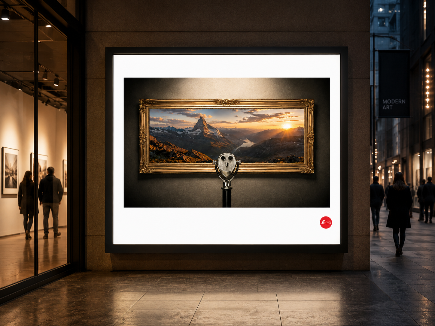
This advertisement explores the clarity and realism of the landscapes captured by Leica.
Rather than presenting the landscape as simply a photograph, the image is designed to feel as though the viewer is looking directly at the scene through a viewing device. This approach emphasizes Leica’s precision and vivid image quality, suggesting that the camera captures not only visual detail, but also the atmosphere and depth of the moment.
The framed landscape and foreground viewer shift the experience from “looking at a photograph” to “being present in the actual scene.”
In this way, Leica is presented not simply as a camera that creates beautiful images, but as a visual tool that brings the emotion and immediacy of reality closer to the viewer.

Portal
PS5 Remote Play
CONCEPT
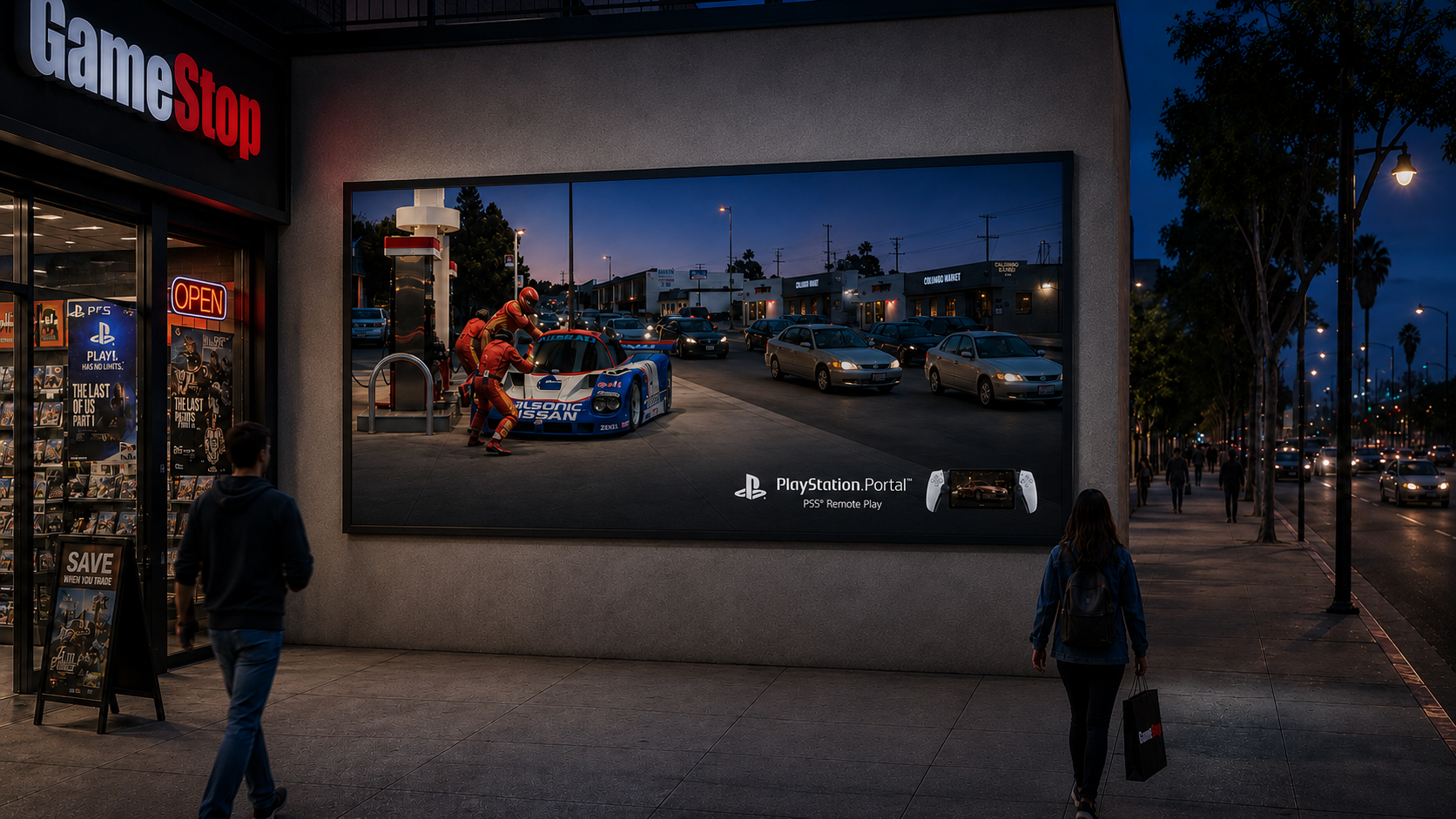
This advertising campaign was created to communicate the PS5 Remote Play experience of PlayStation Portal in a clear and immediate way.
The core idea was to extend the gaming experience beyond the home and show how the boundaries of where you can play have disappeared.
PlayStation Portal is more than a portable device—it allows players to continue the familiar PS5 experience wherever they are. The campaign visualizes this idea as “the game world entering everyday reality.”
Six Flags Magic Mountain — SCREAM
So terrifying, you can’t help but close your eyes.
CONCEPT
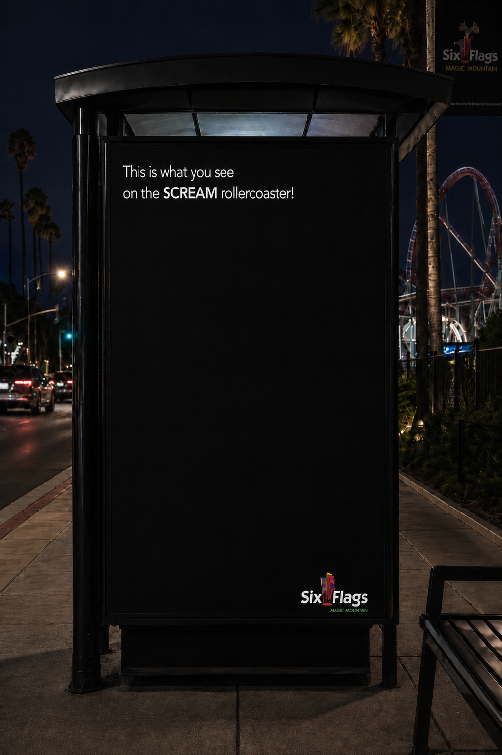
This concept ad expresses the extreme fear and thrill of Six Flags Magic Mountain’s SCREAM roller coaster through a minimal visual approach.
The all-black layout is not simply a minimalist design choice—it represents the rider’s point of view at the moment they become so terrified that they close their eyes.
The headline,
“This is what you see on the SCREAM rollercoaster!”
completes the idea when paired with the black screen.
At first, the viewer sees what appears to be an empty black image. But after reading the headline, the concept becomes clear: you see nothing because the ride is so terrifying that you instinctively shut your eyes.
Novita
ULTRASONIC HUMIDIFIER
Moist Air, Healthier Living
CAMPAIGN MEDIA
Magazine Advertising / Direct Mail / Outdoor Advertising
CONCEPT STORY
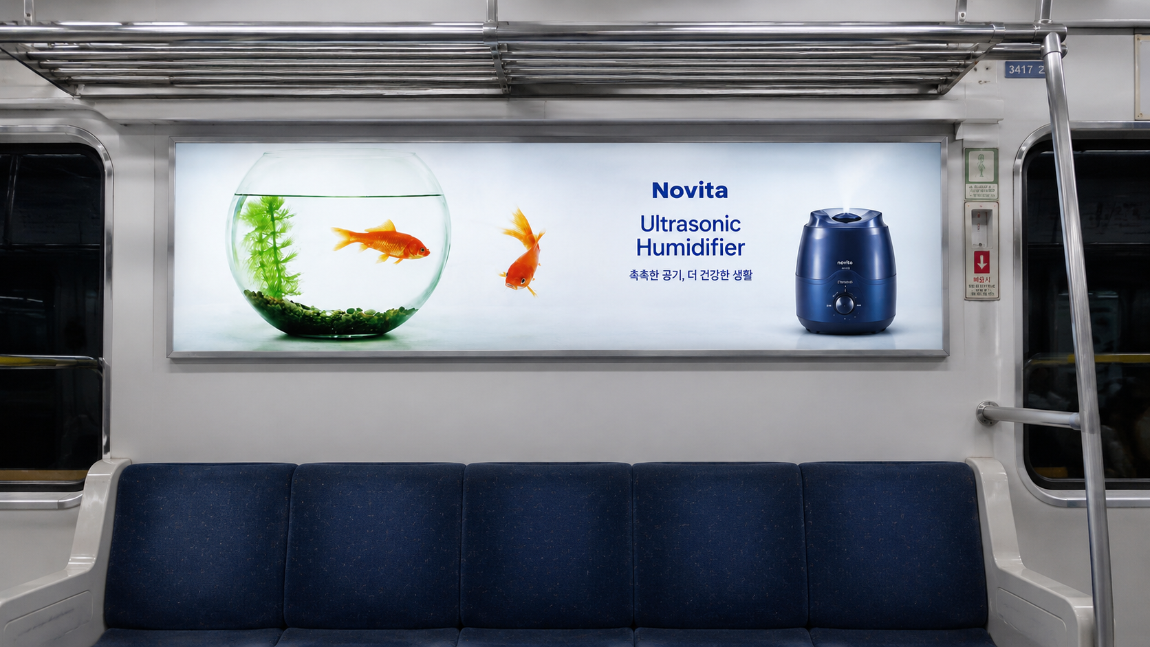
Because dry air is invisible, the effect of a humidifier can also be difficult to visualize.
This advertisement transforms the invisible idea of humidity into the familiar image of an underwater environment. A goldfish swimming naturally outside its bowl suggests that the surrounding air has become moist enough to feel almost like water.
Rather than explaining the product’s function first, the concept is designed to let viewers immediately feel the sensation of humid, comfortable air through a single memorable image.
IAMS — For Smart Puppy
What if your puppy became smarter—how far could it go?
CONCEPT STORY
This campaign focuses on turning the product name “Smart Puppy” into an actual behavior and situation, rather than treating it simply as a name.
In the first visual, a puppy controls a robotic dog with a remote control, using humor to express intelligence and learning ability. Normally, a dog is expected to follow human commands. In this ad, that relationship is reversed—the puppy becomes the one giving commands and controlling another subject.
Execution Idea 2 — Before / After Floor Plan
This concept expresses the change in a puppy’s spatial awareness and learning ability through the familiar visual language of a floor plan.
In the Before version, every area is presented as if it is perceived in the same way. In the After version, each space is clearly distinguished according to its function.
Through this approach, the ad communicates that IAMS Smart Puppy is not only about physical growth, but also about the development of learning and understanding. Rather than simply saying that a puppy becomes “smarter,” this idea visually demonstrates a meaningful change in how the puppy understands, organizes, and interprets the world around it.
Benihana Restaurant
Since 1989
BENIHANA TEPPANYAKI RESTAURANT
Benihana Teppanyaki Restaurant
Benihana is more than just a restaurant that serves food — it offers a dining experience in which the chef’s performance and the cooking process itself become a form of entertainment.
This advertisement expands on that idea by presenting cooking as a show. The lobster and ingredients are treated like performers on a stage, while the red curtain and spotlight visually capture the energy, excitement, and theatrical quality of the teppanyaki cooking experience.
The red circular stage at the center functions both as a performance platform and as a visual element that evokes Japan, helping communicate Benihana’s distinctive dining experience through a more memorable and engaging image.